I have recently completed a typography shirt design for the Threadless “Drawing” competition. I’ve always loved hand-done typography, and have recently started to give it a go. By no means am I an expert (this takes me WAY longer than it should) but I attempted to document the process for all of you to see. Hope ya like it, and feel free to VOTE FOR IT HERE!

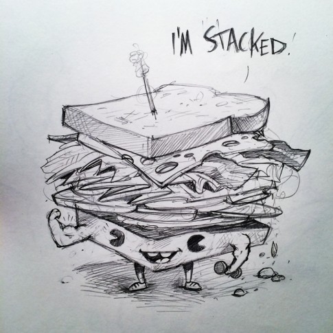
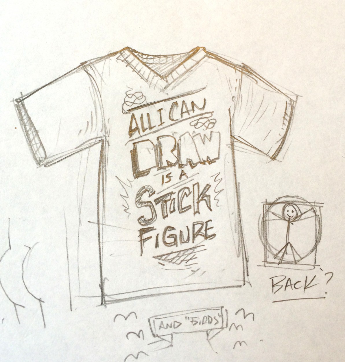
It all starts with a stupid little doodle in my sketchbook. I thought it might be ironic to do an elaborately drawn version of the most common comment I get by “non-artists.”

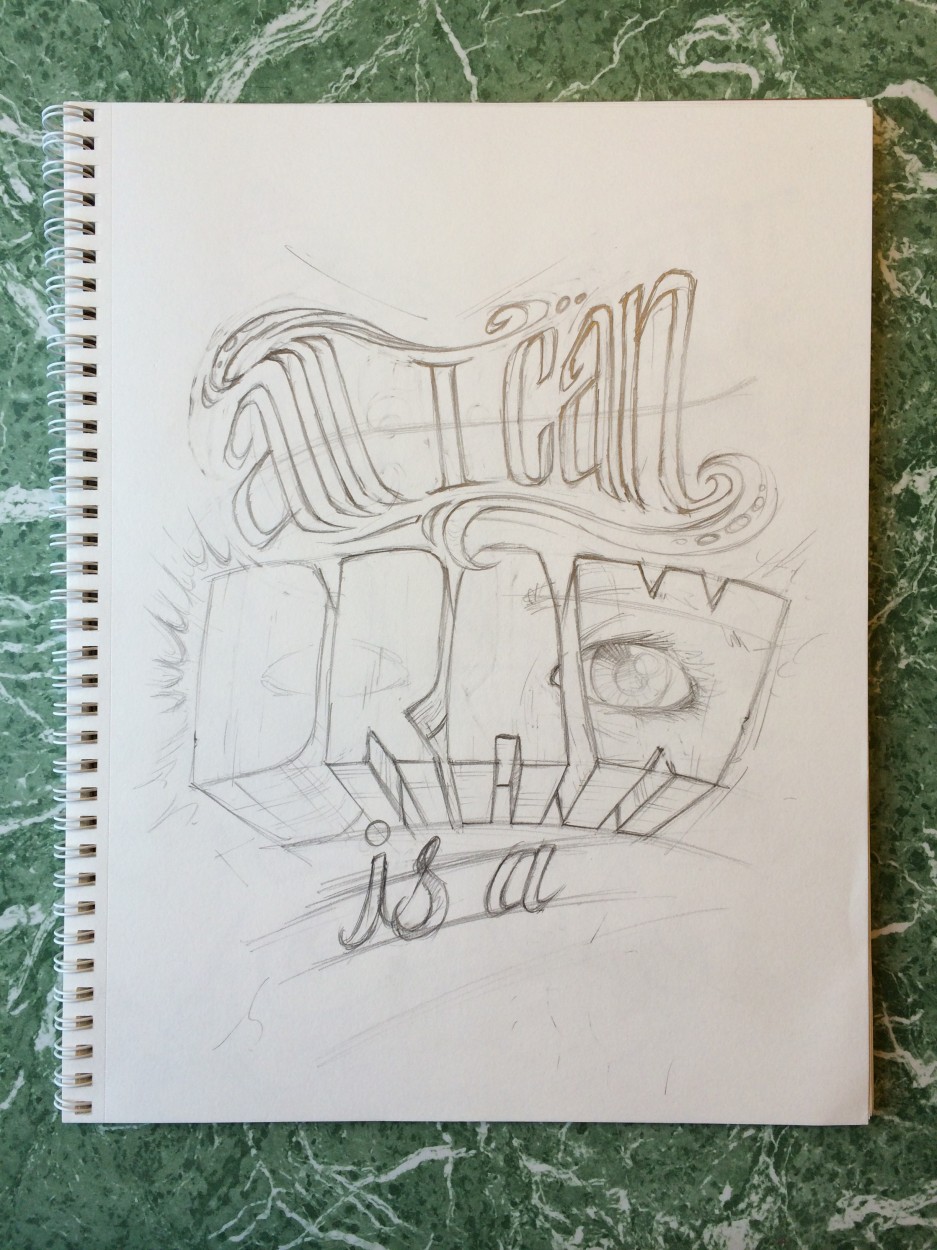
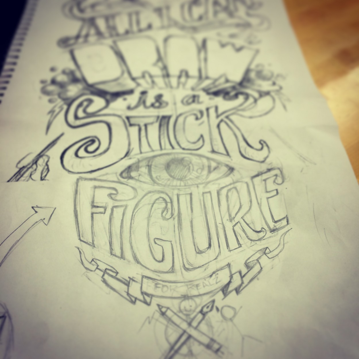
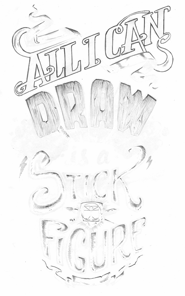
Next I started working much larger in my sketchbook – playing around with they style of type to use.

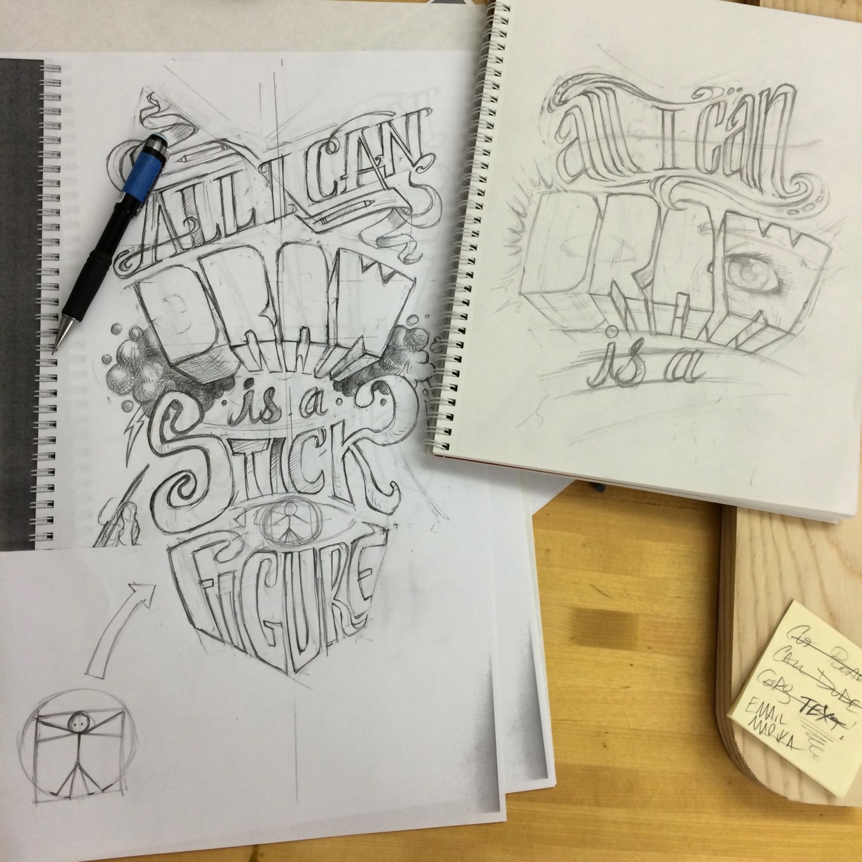
After sitting on the first version overnight I decided I wasn’t very happy with it. Above is my second attempt, this one will be the base for the design.

The only part that I still wasn’t happy with was the “Figure” text – so here is a revised version of that.

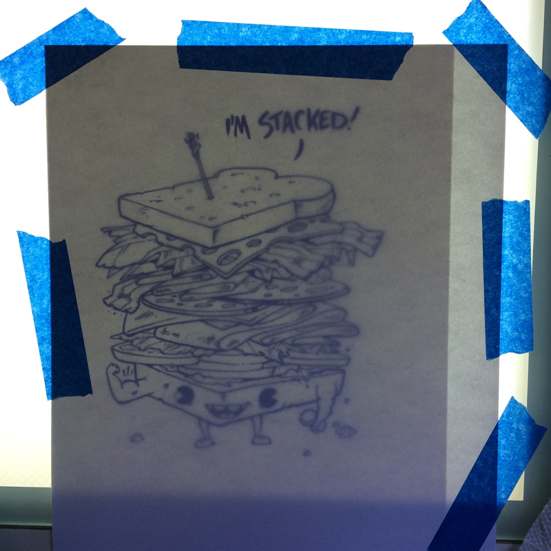
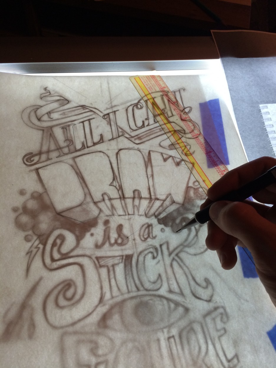
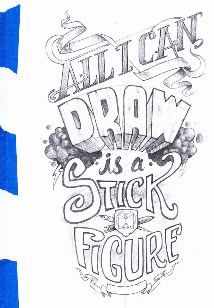
After all this rough sketching is done I like to put the sketch on a lightbox and use it transfer the drawing onto a cleaner sheet. This way I can use a ruler to alight the text and really get the clean edges I’m looking for. Since the final for this design will be the actual pencil drawing, this stage is important.


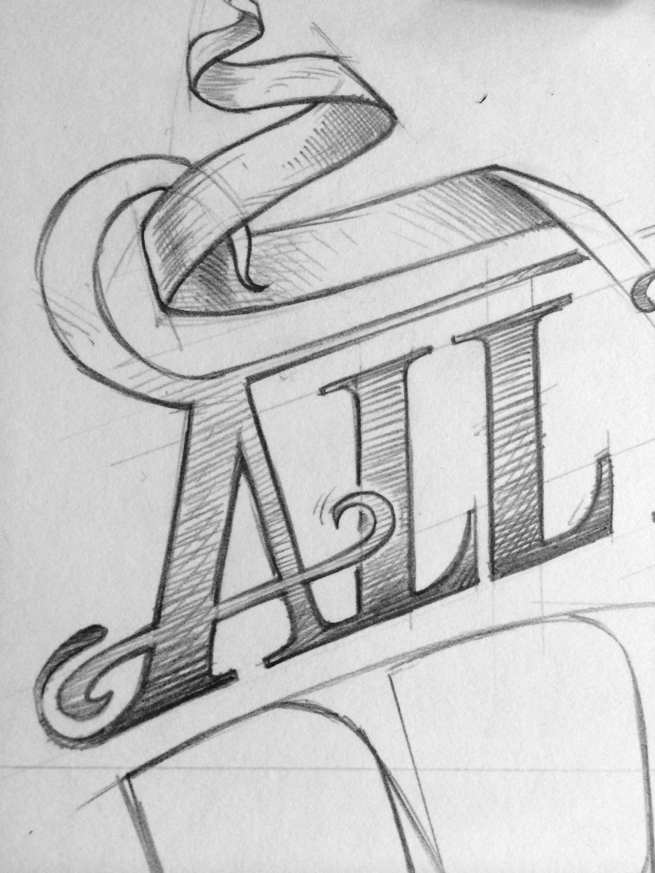
Here are some close-ups of the final setup.

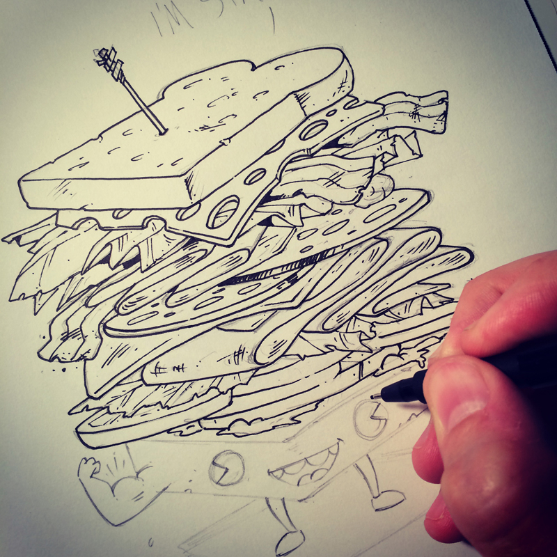
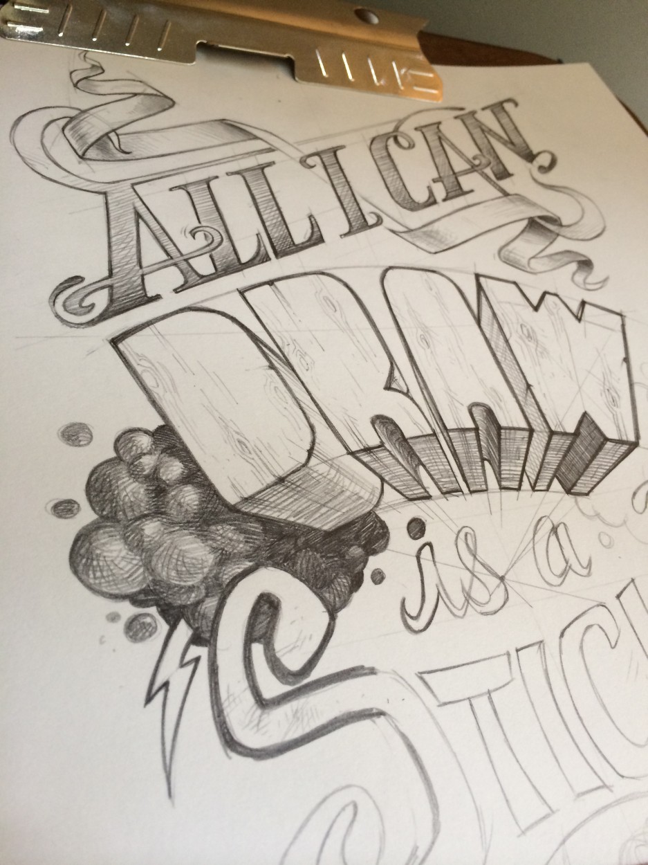
Once the drawing is outlined it’s time to render the drawing from top to bottom! This is one of my favorite parts.

This is a scan of the final pencil layer.

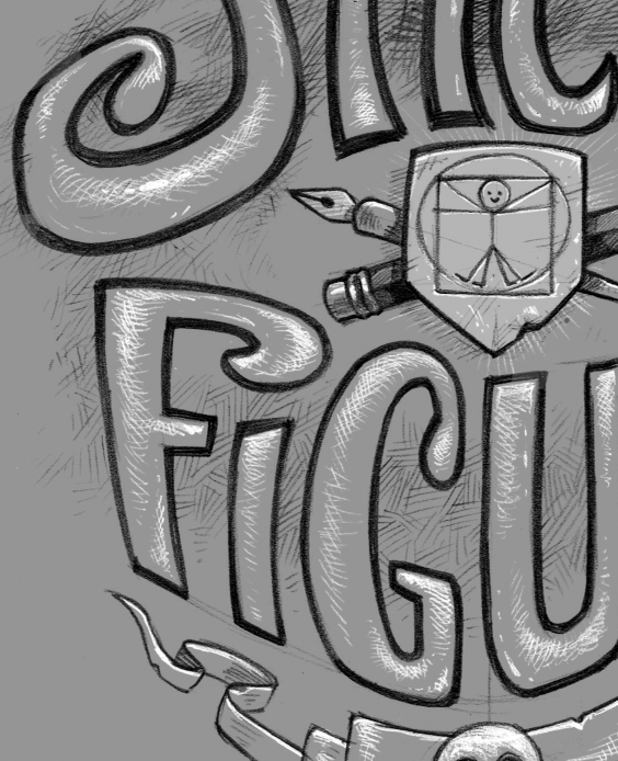
Then I used the lightbox AGAIN to create a “highlights” layer in pencil. All the lines I put down here will be turned white once they are scanned, so I have to kind of think in reverse.

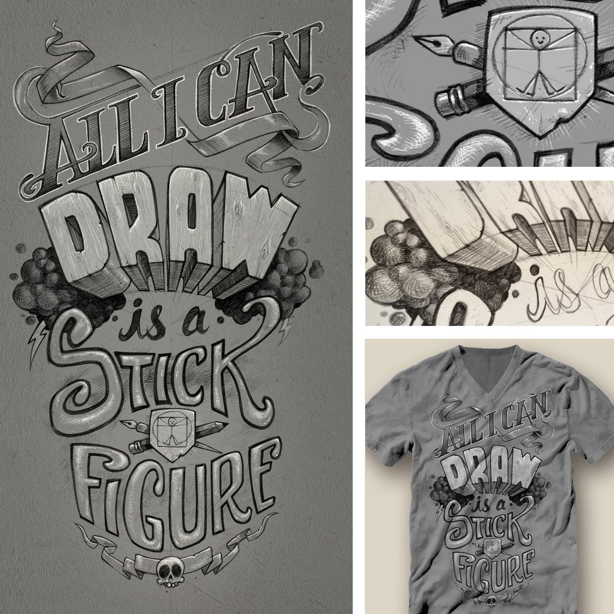
Example of the final layering…

TA-DA! The final is done and READY FOR YOUR VOTE on Threadless! It’s my 100th submission to Threadless! Holy cow!

